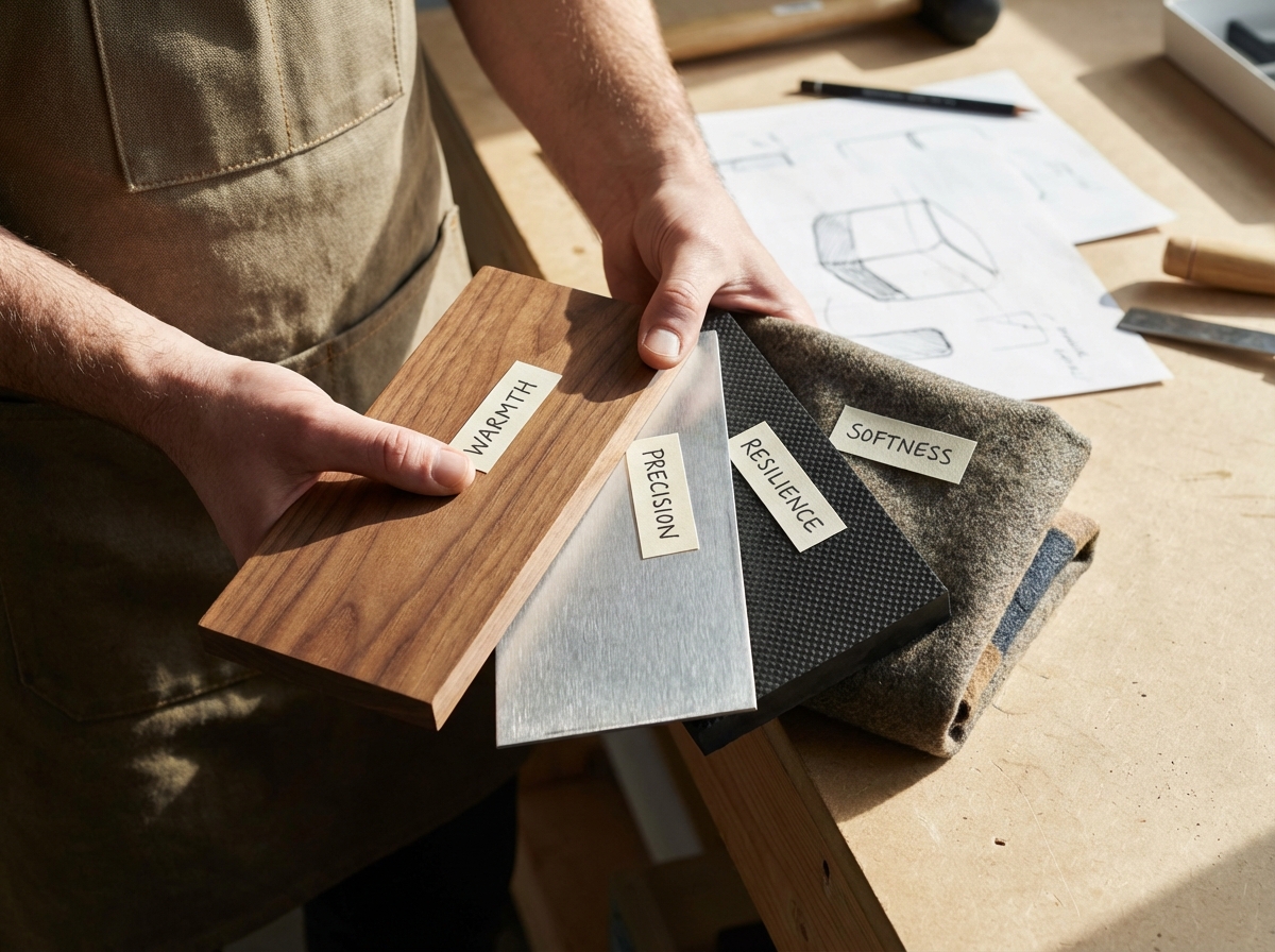
The first time I held two products side by side — one in brushed aluminum, one in matte polypropylene — I realized I was reacting emotionally before I’d even used either one. The metal felt serious. The plastic felt temporary. Neither had done anything yet, but I’d already formed an opinion.
If you’re looking to learn emotional materials in design, the core idea is simpler than most design theory makes it sound: every material carries a psychological signal, and that signal arrives before any conscious thought does. Wood reads as warmth. Glass reads as precision. Rubber reads as protection. Learning to choose materials the way a writer chooses words — deliberately, with emotional intent — is one of the most underrated skills in product, interior, and UX design.
- If you’ve ever designed something that looked right but still felt wrong to users, the material selection was probably the silent culprit
- The ability to map specific materials to specific emotions lets you build a personal design library that gives your work a consistent, recognizable emotional signature
- This skill matters equally whether you’re designing physical products, branded environments, or tactile UI elements with texture and weight metaphors
What “Emotional Materials” Actually Means in Design
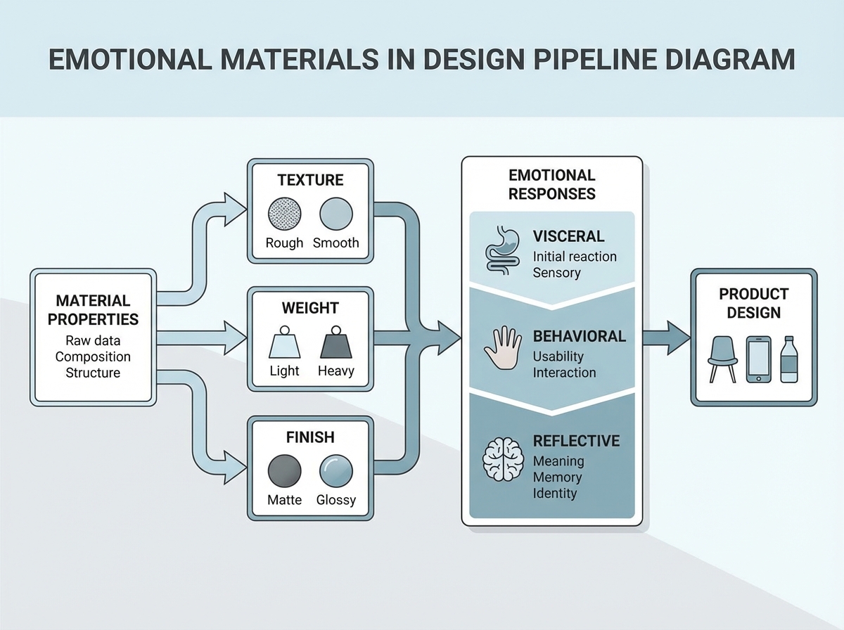
Emotional materials design is the practice of selecting and combining physical or visual materials based on the emotional responses they reliably trigger in people. It sits at the intersection of material science, sensory psychology, and design craft. It’s not the same as choosing colors for mood — it goes deeper than that, into texture, temperature, weight, surface finish, and the cultural memory attached to each material category.
The three primary entry points into emotional materials work are:
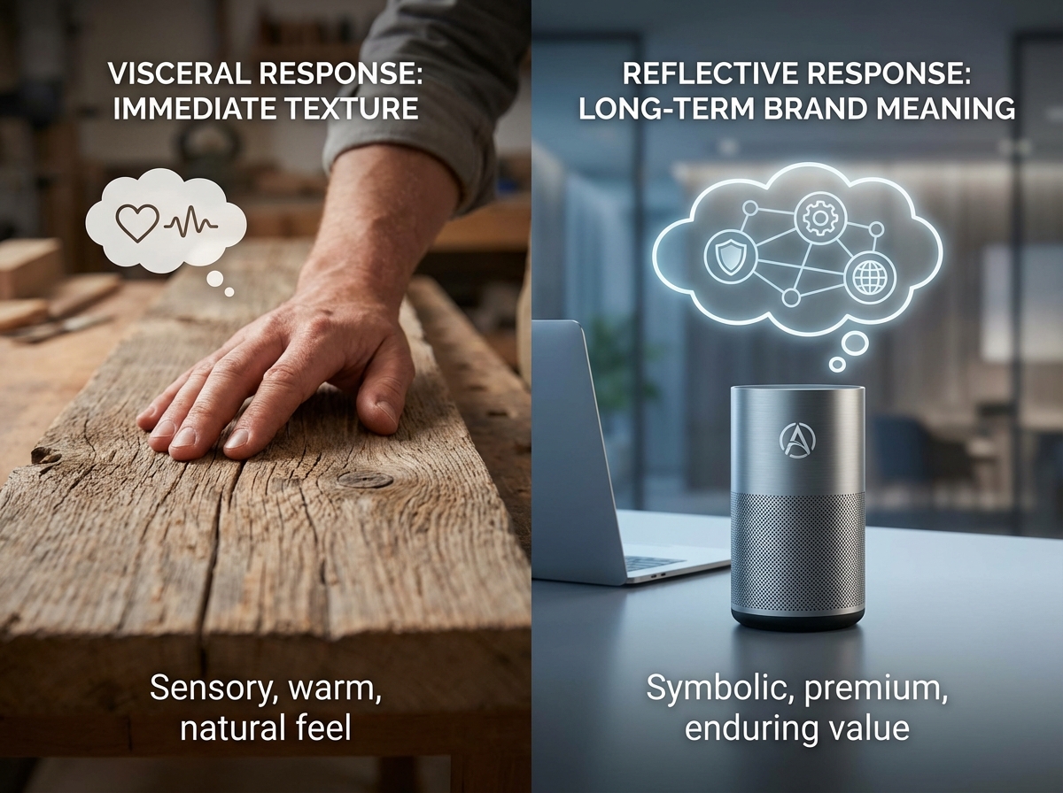
- Visceral response — the immediate gut reaction to a material’s appearance or touch (smooth glass feels expensive; rough concrete feels durable)
- Behavioral response — how the material affects ongoing interaction (soft rubber grips invite longer holding; hard plastic edges encourage quick release)
- Reflective response — the meaning a person assigns to a material after using it (bamboo feels sustainable; chrome feels industrial-era nostalgia)
Understanding which level you’re designing for changes every decision you make downstream.
Sharp Insights Most Beginners Miss
- Plastics can feel premium — but only if the finish and weight distribution are right
- The emotional signal of bamboo is almost entirely cultural, not tactile
- Rubber’s emotional range spans from clinical (latex) to playful (silicone) with no middle ground
How Long Does It Actually Take to Build Material Intuition?
| Stage | Content | Time |
|---|---|---|
| Foundation | Material families, classification, basic properties | 1–2 weeks |
| Recognition | Identifying plastics, metals, fibers, rubber by properties | 1–2 weeks |
| Emotion mapping | Linking material categories to emotional registers | 2–3 weeks |
| Library building | Curating your own emotional material references | Ongoing (start at week 4) |
| Application | Using material choices to write a design statement | Week 6 onward |
| Total | From zero to applied emotional material fluency | 6–8 weeks |
The order of those stages matters far more than the speed — trying to map emotions before you can recognize material categories reliably is like trying to write poetry before you know what a noun is. And if you take ten weeks instead of six, you haven’t failed; you’ve just spent more time in the recognition phase, which is actually where most of the real work happens anyway.
The Mistake Almost Everyone Makes at the Start
The single biggest mistake people make when learning emotional materials is treating material selection as an aesthetic decision rather than a communicative one. They choose a material because it looks good in the render, not because of what it will say when someone touches it, carries it, or sees it on a shelf next to a competitor’s product. I did this for longer than I’d like to admit — I’d pick matte black finishes because they photographed well, without ever asking what emotion matte black was actually encoding. (Turns out: sophistication, yes, but also coldness and approachability problems in some user groups.)
The shift happens when you start treating each material as a sentence. A sentence has a meaning independent of the context you put it in. Polished chrome says one thing. Unfinished wood says another. You can put them next to each other intentionally for contrast, but you can’t put them next to each other accidentally and expect users not to notice the contradiction.
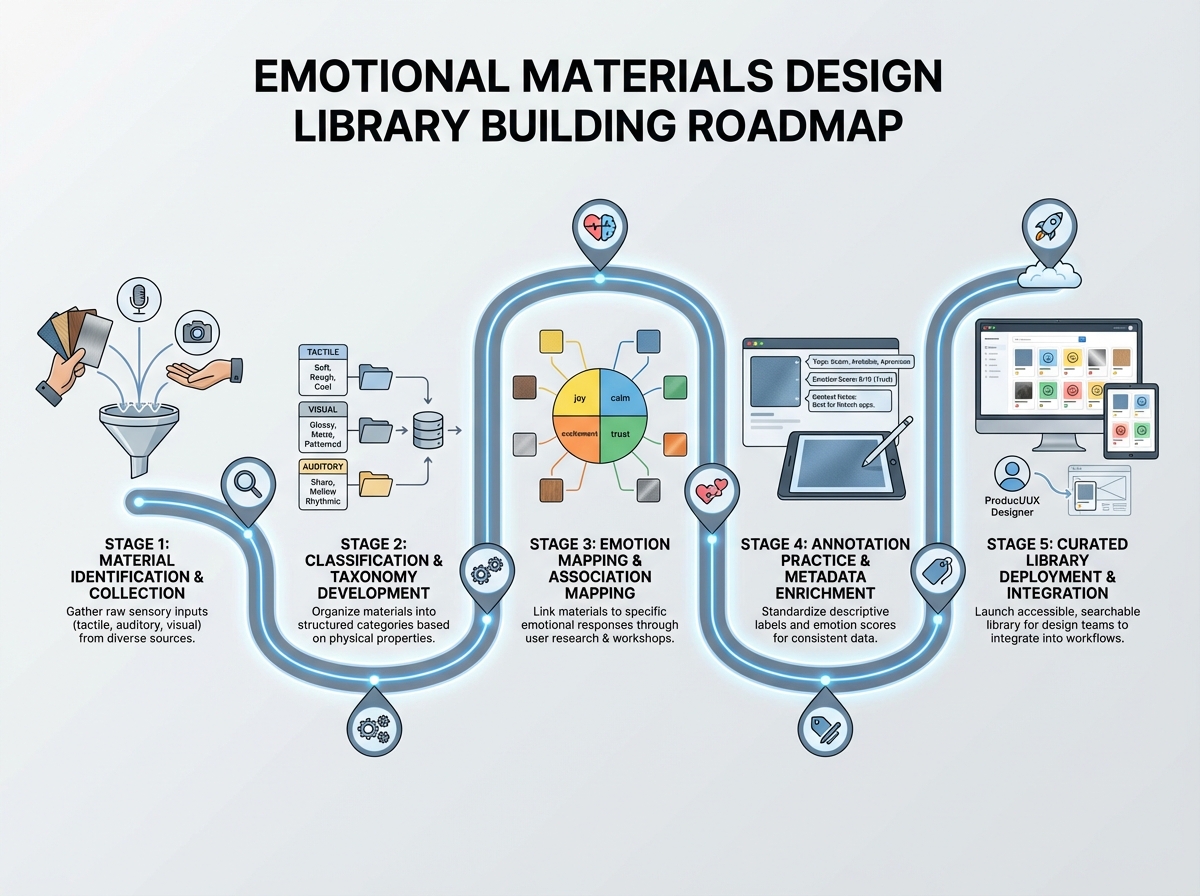
The designers who develop genuine material fluency early are the ones who start building a reference library immediately — not just saving images, but annotating them. What emotion does this evoke? What property creates that emotion? Is it the weight, the temperature, the reflectivity, the grain?

Getting Comfortable With Material Classification
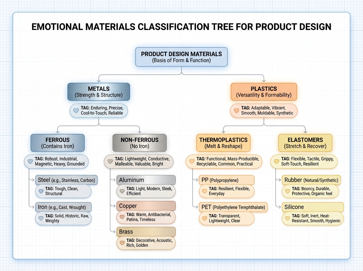
Before you can think emotionally about materials, you need a mental map of how materials are organized. Most designers skip this because it feels like engineering homework. That’s a mistake. The classification system is actually a shortcut — once you understand that polymers branch into thermoplastics and elastomers, you immediately know why a silicone phone case feels fundamentally different from a polycarbonate one, even if they’re both technically plastic.
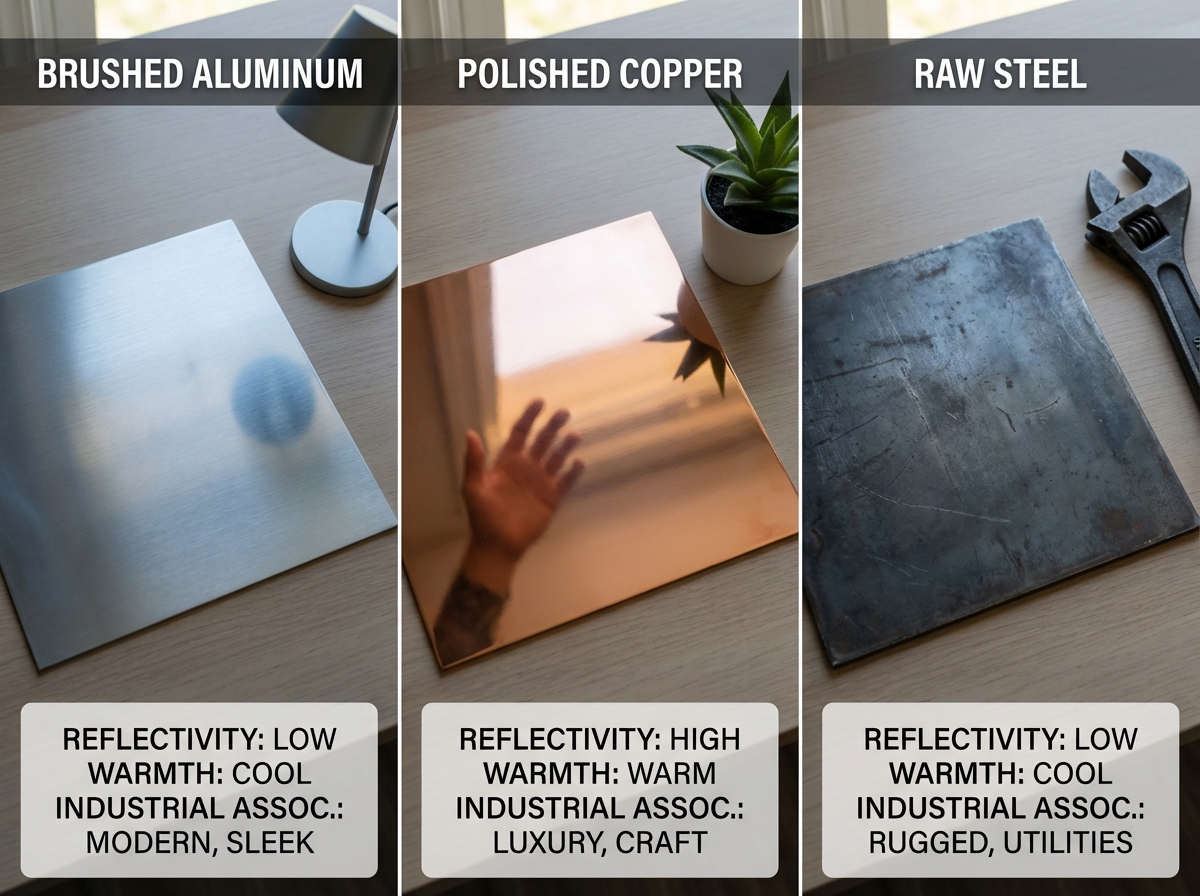
Metals split into ferrous and non-ferrous categories. Ferrous metals — steel, cast iron — carry heaviness, permanence, and industrial connotations. Non-ferrous metals like aluminum and copper read very differently: lighter emotionally and physically, more associated with precision instruments, cooking, and technology. Sheet metal specifically has a design personality that shifts dramatically based on finish — raw steel feels unfinished and utilitarian; powder-coated steel feels intentional and protective.
Plastics are the most emotionally complex category because they have the widest variance. A thermoplastic like ABS used in a cheap toy communicates completely different things than a high-density polyethylene used in premium outdoor gear, even though both are technically plastic. The emotional perception of plastic is almost entirely driven by density, finish, and manufacturing precision — not the material itself. This is the insight that changes how you think about the entire category.
What Metals Actually Communicate
Metal is one of the most emotionally loaded material categories in design, and most people only think about it in terms of appearance. But the emotional signal of metal comes from at least four properties working together: weight, temperature, reflectivity, and sound. A metal object that feels light immediately loses some of its authority signal — which is why premium products often use denser alloys not for structural reasons but for emotional ones. The weight is doing communicative work.
Aluminum anodized in black communicates restraint and technical precision — it’s the material language of high-end electronics. Brushed stainless steel communicates hygiene and durability — it’s why it dominates medical equipment and professional kitchens. Copper communicates craft and warmth — it’s why it’s appeared in artisanal product design and boutique coffee equipment as fast as it has. None of these are accidents. Each is a designer somewhere making a deliberate emotional materials choice.
For designers learning this for the first time — whether you’re in UX research and design or physical product work — the practice of asking “what is this metal saying?” before finalizing a spec is something that fundamentally upgrades every project you touch.
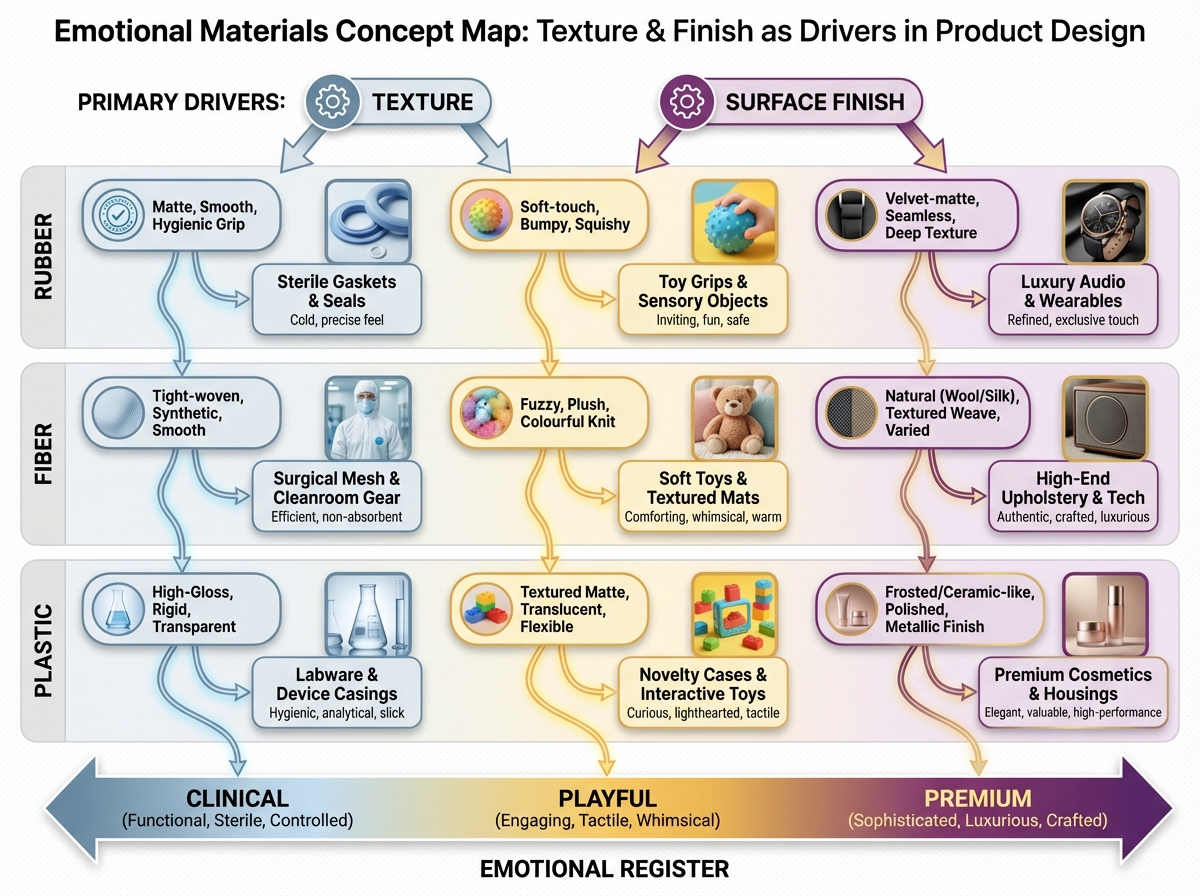
The Emotional Grammar of Plastics, Rubber, and Fiber
Plastics got a bad reputation emotionally — and they earned some of it. But the nuance matters. High-gloss ABS in toy design communicates accessibility and fun. The same plastic in a matte finish communicates nothing interesting at all. Polycarbonate — used in riot shields and bulletproof glass — communicates protection when visible and technological invisibility when used as a transparent enclosure. The emotional range of the plastic family is enormous if you know how to navigate it.
Rubber is a fascinating case study in contextual emotion. Natural rubber evokes something organic and resilient. Synthetic rubber in a clinical context (latex gloves) evokes sterility and medical precision. Silicone — which most people group mentally with rubber — actually communicates softness-with-precision: it’s the material of baby products, premium kitchen tools, and wearable tech. The emotional signal of rubber almost never comes from the base material — it comes from surface texture, color, and the context it appears in.
Fiber materials — textiles, carbon fiber, woven composites — have a distinct emotional register tied to direction and pattern. Carbon fiber communicates performance and exclusivity in ways that straight metal can’t, partly because the weave pattern is visually complex. Natural fibers like linen or jute communicate slowness, craft, and environmental awareness. The braided or woven structure itself communicates effort, which is a surprisingly powerful emotional signal in product design.
Bamboo and the Material That Carries a Story
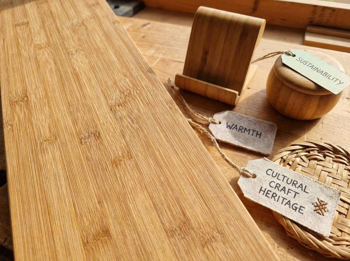
Bamboo is one of the most instructive materials to study in emotional design because its emotional power is almost entirely narrative, not tactile. If you handed someone a strip of bamboo with no context, they might notice its lightness and warmth — properties shared with many other materials. But when you frame it as bamboo — when the grain is visible, when the form references its natural origin — it triggers a whole cascade of associations: sustainability, growth, Asian craft traditions, natural intelligence.
This is the principle of cultural memory in materials. Every material carries a social history, and that history is part of what users are touching when they touch a product. Bamboo’s story is mostly positive right now — sustainable, fast-growing, strong. But fifty years ago, bamboo furniture in Western markets read as cheap and temporary. The material didn’t change. The cultural framing did. That’s a crucial lesson: emotional materials aren’t fixed. They’re contextual.
For product designers working in any category where environmental values matter to the end user, understanding bamboo’s emotional vocabulary — and knowing when it works and when it feels like greenwashing — is a genuinely useful skill. The same logic applies to reclaimed wood, raw concrete, and unfinished brass: all materials whose emotional signal is more story than surface.
Building a Material Library That Actually Shapes Your Design Decisions
The practical output of all this is a personal reference library — not a Pinterest board, but an annotated system. Every entry answers three questions: What is this material? What does it communicate emotionally, and in what contexts? What are its closest alternatives if I need to shift the emotional register slightly?
Most designers who try to build this library start too broad. They collect everything interesting. The library becomes a museum with no taxonomy, and two years later it’s a folder of unlabeled images they never open. The useful version is organized by emotional outcome first, material second. You don’t search it by asking “what kind of plastic is this?” — you search it by asking “what can I use when I need to communicate warmth without weight?” or “what reads as luxurious but not cold?”
Once you have that library, something shifts in how you work. Material choice stops being something you decide at the end of the design process — it becomes part of the brief. Before you sketch the form, you’ve already asked: what should this feel like to hold? What should it say when someone sets it down on a conference table? What material makes that sentence the most clearly?
Closing: What You’re Actually Learning When You Learn This
Looking back, learning emotional materials didn’t make me a better visual designer. It made me a more honest one. It gave me a language for the gap between how something looks and how it makes people feel — which turns out to be the gap where most design problems live.
Here’s what to do with this knowledge immediately:
- Pick up five objects near you and name their emotional signal — not the material, but what it communicates: authority, approachability, warmth, precision. If you can’t name it, that’s the gap to work on first.
- Start annotating, not just collecting — when you save material references, write one sentence about the emotional register and why the texture or finish creates it.
- Learn the plastics taxonomy before you touch anything else — thermoplastics, elastomers, and thermosets behave differently emotionally, and conflating them is the most common source of confused material choices.
- Study the same object in two different finishes — matte versus gloss, brushed versus polished. The emotional delta between those two versions is more instructive than reading ten articles about material theory.
- Build your library around emotional outcomes, not material categories — organize by the feeling first, the material second.
- Pay attention to material contradictions in products you already love — a soft-touch coating on a hard plastic body, for example. What emotional work is that contradiction doing? Usually it’s resolving two competing signals the designer needed to carry simultaneously.
- Notice when bamboo (or any narrative material) is doing emotional work that the product can’t otherwise earn — if you’re using a “story material” as a shortcut, it’ll feel hollow. If you’re using it because it genuinely aligns with the product’s values, it’ll feel inevitable.
- Before finalizing any material spec, ask the sentence test — read the material choice as a sentence directed at the user. If you wouldn’t want to say that sentence out loud, change the material.
Leave a Reply