The first time you open Figma with the intention of designing a real app, nothing happens the way you expect. You know what the app should do. You just have no idea where to put anything.
If you’re looking to learn mobile app design in Figma, the honest answer is that the tool itself is the easy part. The hard part is knowing what to build before you build it — and that’s exactly what most beginners never figure out on their own.
- Most people start in Figma too early, before they understand what the user actually needs.
- Low-fidelity wireframing forces you to make decisions about structure and flow before you get distracted by color and typography.
- The designers who move fastest are the ones who slow down at the research stage first.
What Low-Fidelity Wireframing Actually Means
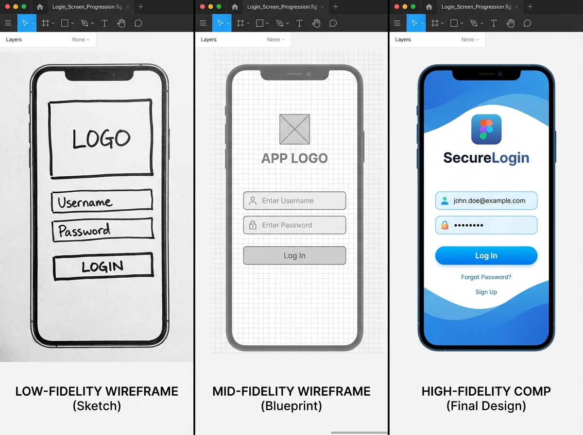
A low-fidelity wireframe is a rough, intentionally simple layout of your app’s screens — boxes, lines, and labels, no colors, no real fonts, no polish. For someone new to mobile app design in Figma, this feels like a step backward. Why not just design the real thing?
Because the real thing is full of decisions you haven’t made yet. A lo-fi wireframe forces you to answer structural questions first: What goes on this screen? What does the user do here? Where do they go next? It’s the difference between building on a foundation and building on sand.
| Fidelity Level | Visual Detail | Purpose | When to Use |
|---|---|---|---|
| Low-fidelity | Boxes and lines | Test structure and flow | Early research and planning stage |
| Mid-fidelity | Grayscale with real layout | Refine spacing and hierarchy | After flows are validated |
| High-fidelity | Full color, real fonts, assets | Handoff to developers | After usability testing |
Three Things That Will Surprise You
- Your user persona will change what you put on the first screen entirely.
- A sign-up flow has at least four decision points most beginners never map.
- Testing a lo-fi prototype catches more errors than testing a finished design.
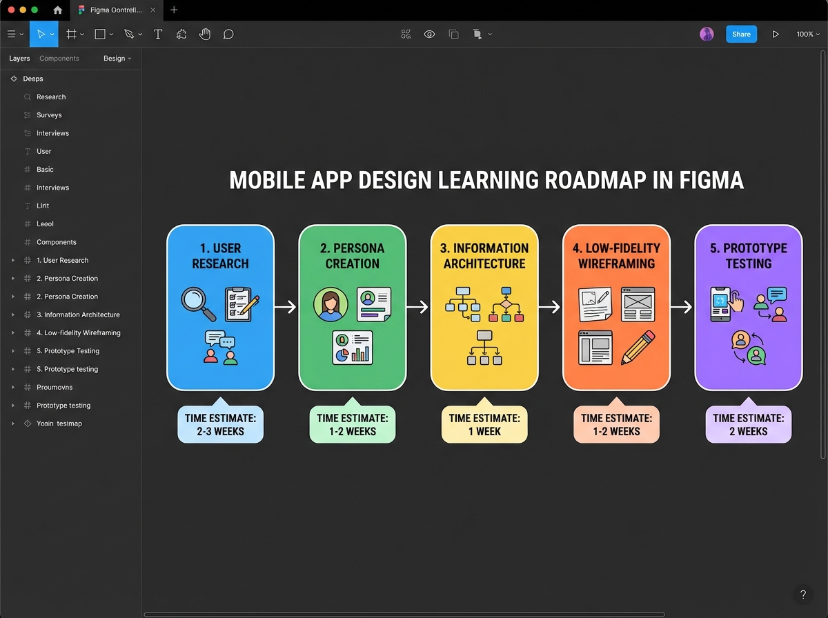
How Long Does It Actually Take?
| Stage | What You’re Doing | Estimated Time |
|---|---|---|
| Research and survey setup | Defining the problem, gathering user data | 3–5 hours |
| User persona and problem statement | Synthesizing research into a design brief | 2–3 hours |
| Information architecture | Mapping screens, hierarchy, and navigation | 2–4 hours |
| Low-fidelity wireframes in Figma | Building core screens: login, wallet, invest | 4–6 hours |
| Prototype linking and usability testing | Connecting screens, running a test | 2–3 hours |
| Total | Full lo-fi design cycle | 13–21 hours |
The order matters more than the speed — skipping research to get to Figma faster is the most common reason wireframes fail usability testing. If you’re taking twice as long as this estimate, that usually means your research phase is doing its job.
Everyone Opens Figma Too Early
The single biggest mistake beginners make when learning mobile app design is treating Figma as the starting point. They open a blank frame, stare at it, and start placing buttons where buttons feel right. Two hours later, they have something that looks vaguely like an app and functions like nothing.
The reason this happens is that designing without research is really just guessing with a grid. You don’t know who you’re designing for. You don’t know what they’re trying to accomplish. You don’t know which screen comes before this one. Every decision you make is arbitrary, and arbitrary decisions stack up into a confusing product.
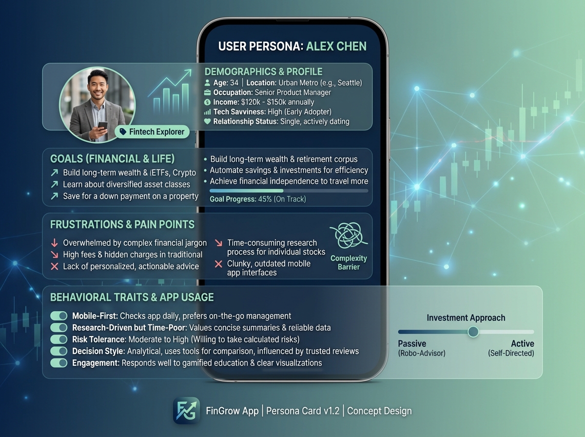
The fix isn’t complicated, but it does require patience. Before you open Figma, you need a user persona — a specific, named, fictional person who represents your actual user. Not “someone who wants to invest money” but “Adaeze, 28, first-time investor, never used a fintech app, distrusts complicated dashboards.” That level of specificity changes every single layout decision you’ll make.
Once you have that person in mind, the blank Figma frame stops being intimidating. You’re not guessing anymore. You’re designing for Adaeze.
The Research Stage No One Talks About
Building a digital survey sounds like a bureaucratic detour when you just want to design. It isn’t. A five-question survey sent to ten real people will tell you things about how your users think that you would never discover by sitting alone in Figma.
What you’re looking for isn’t data — it’s language. When someone describes a problem in their own words, they give you the exact phrasing that should appear in your interface. If three out of ten people say they find investment apps “overwhelming,” that single word tells you to simplify, reduce options on the home screen, and add progressive disclosure. The survey is research, yes, but it’s also a copywriting session.
The problem statement you write after this research isn’t a formal document. It’s a sentence you keep open in a tab while you’re designing. Something like: “Adaeze needs a way to start investing small amounts without feeling like she needs a finance degree.” Every screen you design either serves that statement or it doesn’t. That clarity is worth more than any Figma plugin.
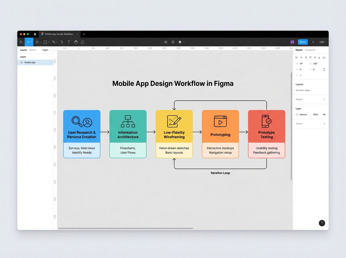
From Blank Paper to Information Architecture
Information architecture sounds academic until you’re staring at a list of fifteen screens wondering which one comes first. IA is just the decision about what lives where and how a user moves between things. For a mobile app, it usually starts with pen and paper before it ever touches Figma.
The exercise that actually works: write each screen name on a sticky note or a piece of paper. Then arrange them in the order a user would encounter them. Now draw arrows between the ones that connect. What you’re looking at is your navigation structure. If a user can reach the “invest” screen from the home screen in two taps, your IA is clean. If they have to pass through four screens first, something is buried.
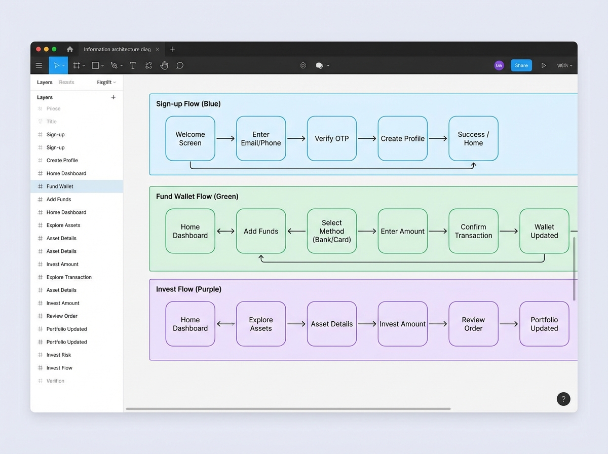
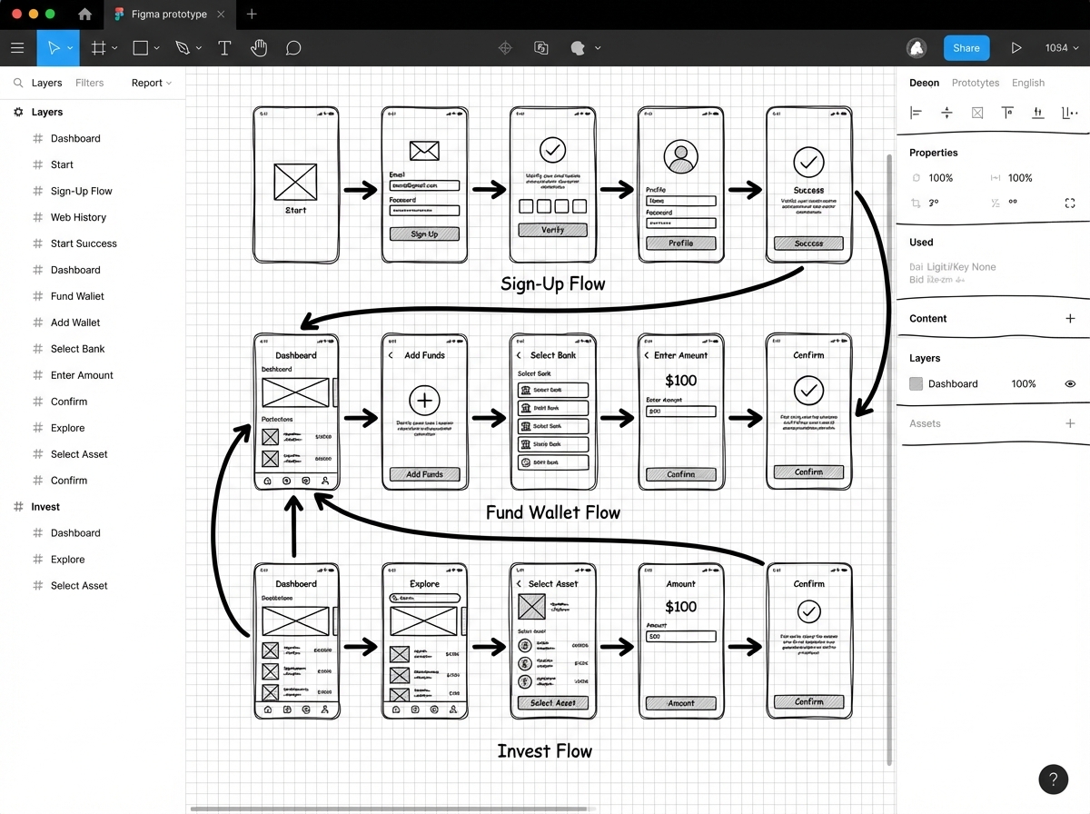
For a fintech app specifically — the kind with onboarding, wallet funding, and investment flows — the IA exercise usually reveals that you need three distinct task flows, not one. The sign-up flow, the fund wallet flow, and the invest flow each have their own entry point, their own decision tree, and their own success state. Building them separately in Figma before you try to connect them is the move that keeps your prototype from becoming a maze.
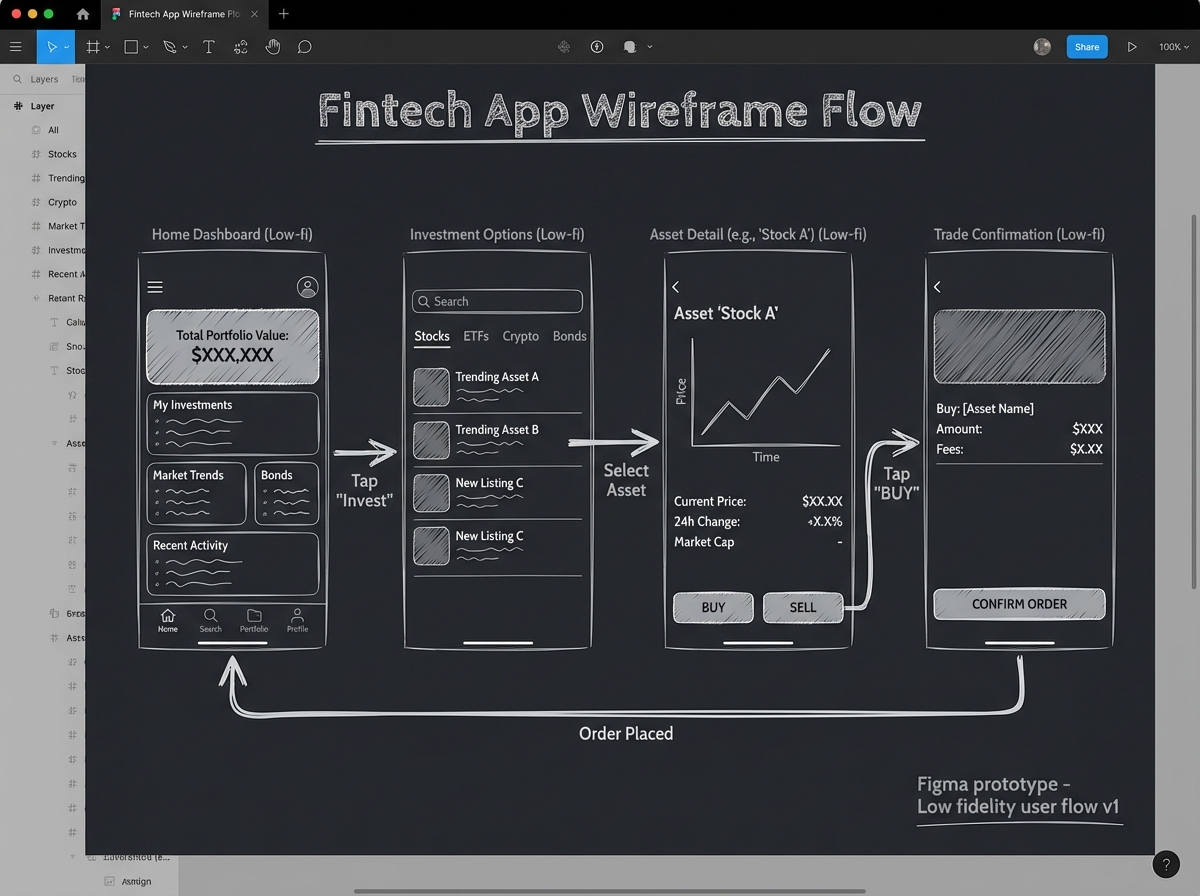
What Low-Fidelity Wireframing in Figma Actually Feels Like
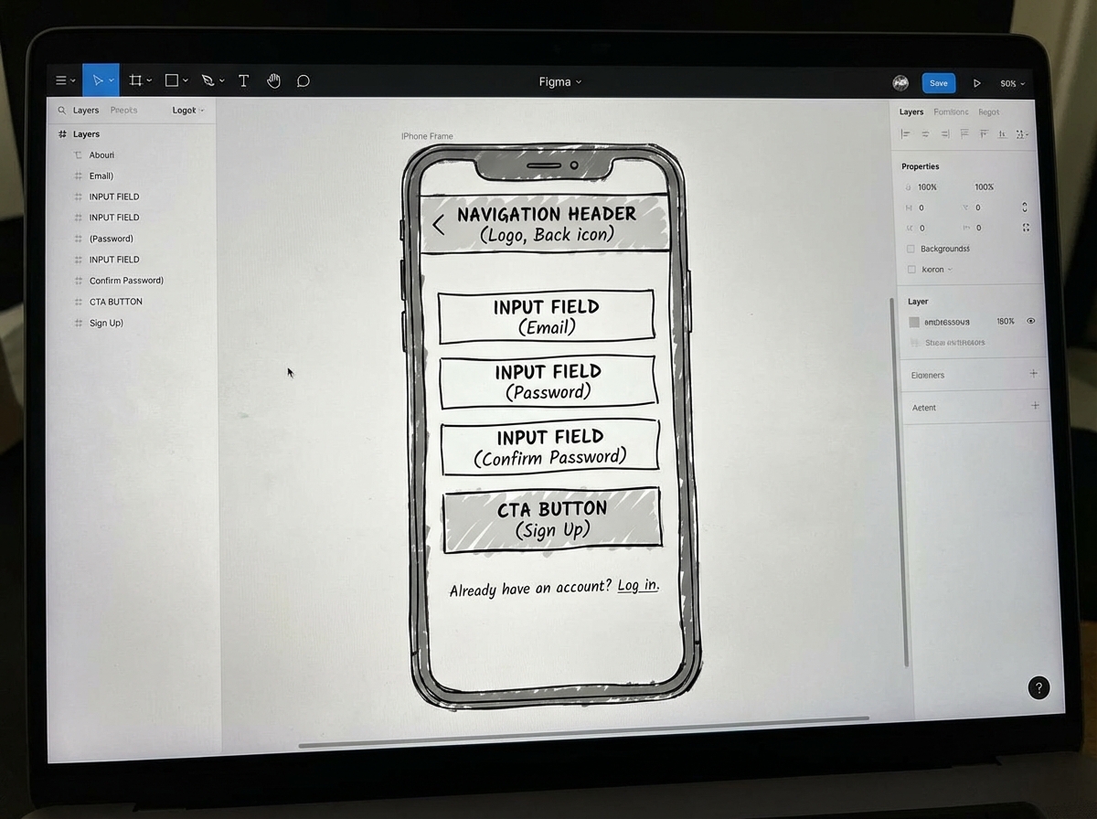
You set up your mobile frame in Figma — iPhone 14, 390×844 pixels — and you start placing rectangles. One rectangle for the header. One tall rectangle for the main content area. A few smaller ones where the buttons will go. It looks like nothing. It looks like a bad sketch.
That discomfort is the point. When you strip out color, typography, and imagery, all you have left is layout and hierarchy. Is the most important action on this screen immediately visible? Is there enough breathing room between elements? Does the user know where to tap? These questions are impossible to answer when a screen looks polished. They’re obvious when it looks like a wireframe.
The sign-up and login flow is usually where this clicks for the first time. You’re not designing a beautiful login screen. You’re deciding: Does the app ask for email or phone number first? Is there a social login option? What happens when the user enters a wrong password? Each of those is a screen state, and you need to account for all of them in your lo-fi prototype before a developer writes a single line of code.
The Three Task Flows That Test Everything
Once your individual screens exist, the real test is whether they connect into coherent flows. For a fintech investment app, three flows cover nearly every UX principle you need to understand as a beginner.
The sign-up and login flow tests your ability to handle state. A user who is new behaves differently from a user who is returning. Your wireframe needs to account for both without requiring two completely different designs. The fund wallet flow tests your ability to communicate trust. Financial apps live and die by whether the user believes their money is safe, and that belief is built through clear labeling, progress indicators, and confirmation states — all things a lo-fi wireframe can validate before you touch a single color.
The invest flow is where most beginner wireframes fall apart. It’s the most complex task, with the most decision points, and it’s the one where cognitive load matters most. If a user has to read instructions to figure out how to invest, the design has failed. Your wireframe should make the next action self-evident at every screen. That’s the test. When you prototype-link these three flows in Figma and walk someone else through them without explaining anything, what confuses them is your next design task.
Testing a Lo-Fi Prototype Before You’re “Ready”
The instinct to polish before testing is almost universal among beginners. It feels exposing to show someone a screen full of grey rectangles and ask them to use it. But this is exactly the right moment to test, because nothing is permanent yet.
Usability testing at the lo-fi stage doesn’t need a lab or a script. It needs one other person and five minutes. You hand them your Figma prototype link — or sit them in front of your laptop — and you give them a task: “Try to invest fifty dollars in this app.” Then you stop talking. You watch where they tap. You notice where they pause. You don’t explain anything, because the design has to explain itself.
What you’ll find, almost every time, is that at least one screen that made complete sense to you is completely opaque to someone else. That’s not failure. That’s the entire point of testing a lo-fi prototype — catching that moment before it costs anything to fix. Moving that one screen or relabeling that one button takes ten minutes in a lo-fi wireframe. In a high-fidelity prototype, it might take half a day.
Preparing for Handoff Without Losing the Thread
At some point, your lo-fi wireframe gets good enough that someone — a developer, a stakeholder, a co-founder — needs to understand what you built. The handoff isn’t just about exporting screens. It’s about transferring context.
Every design decision in your wireframe was made for a reason rooted in your research. The fund wallet screen has a progress indicator because your survey told you users feel anxious about incomplete transactions. The invest screen shows a confirmation step because your persona distrusts one-click actions with money. None of that context lives in the Figma file unless you put it there.
Annotations in Figma — even simple text notes beside each screen — are what separate a wireframe that a developer can build from a wireframe that generates twenty follow-up questions. Before you hand off anything, walk through every screen and ask: if I weren’t here to explain this, would a developer know why it works this way? If the answer is no, add a note. That discipline, more than any design skill, is what makes you someone a development team actually wants to work with.
What I’d Tell Myself Before Starting
Looking back at the full workflow — research, personas, IA, wireframing, prototyping, testing, handoff — the thing that’s hard to see from the beginning is how interconnected each stage is. Rushing the research makes the wireframes feel hollow. Skipping the IA makes the prototype feel like a collection of screens instead of an app. The discipline of going in order, even when it feels slow, is what makes the final prototype feel inevitable rather than arbitrary.
Here’s what to do from day one:
- Start with a real user problem, not a feature list. Write one sentence describing what your user is struggling to do. Design decisions that don’t serve that sentence should be cut.
- Do the pen-and-paper sketch before Figma. Five minutes of sketching eliminates an hour of moving things around on-screen. The rough sketch is thinking; the Figma file is execution.
- Name your user persona and keep it visible while you design. Paste it in a corner of your Figma canvas. Every layout decision should be answerable with “because Adaeze would do this.”
- Build your information architecture as a separate Figma page. Map all screens and connections before designing any of them. This prevents the buried-feature problem that kills fintech app usability.
- Design each task flow independently before connecting them. Sign-up, wallet, and invest flows each have their own logic. Conflating them early creates navigation confusion that’s hard to untangle.
- Test your lo-fi prototype with someone who wasn’t involved in designing it. Internal testing finds nothing. An outside perspective finds everything.
- Annotate your screens for handoff as you go, not at the end. The reasoning behind each decision is freshest when you just made it. Waiting until handoff means you’ll forget half of it.
- Resist adding visual design until every flow passes usability testing. Colors and fonts make wireframes feel finished before they’re functional. Stay in grayscale until the structure is proven.
Leave a Reply