There’s a moment every intermediate WPF developer hits where UserControls stop feeling like the right answer. Everything you build starts looking like a workaround. The templates don’t compose cleanly, the styles bleed into each other, and you realize you’ve been patching the surface without understanding what’s underneath.
If you’re looking to learn WPF custom control development, the honest answer is that it’s not a single technique — it’s a shift in how you think about the entire UI layer. A custom control in WPF isn’t just a restyled button or a slightly modified ListBox. It’s a self-contained, templateable, inheritable UI primitive that separates its visual contract from its behavioral logic entirely. Once that distinction becomes real to you, most of the confusion disappears.
- WPF custom controls are only worth building when you need full ControlTemplate override capability — for everything else, UserControl is faster
- The moment your UI component needs to be styled differently across themes or consumed by other teams, a custom control becomes non-negotiable
- Starting from ContentControl or ItemsControl instead of Control directly cuts 60% of the boilerplate and forces the right structural decisions early
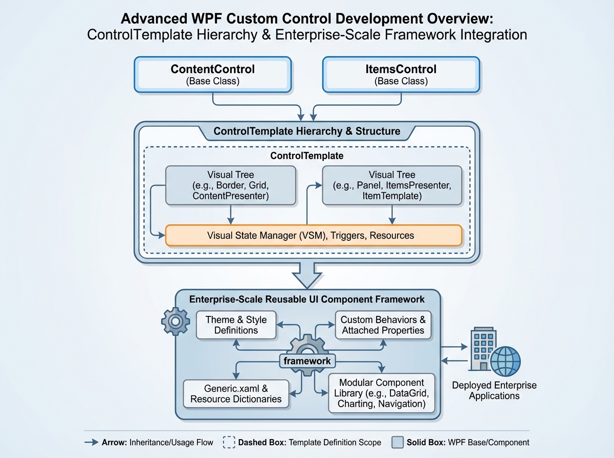
What “Custom Control” Actually Means in WPF
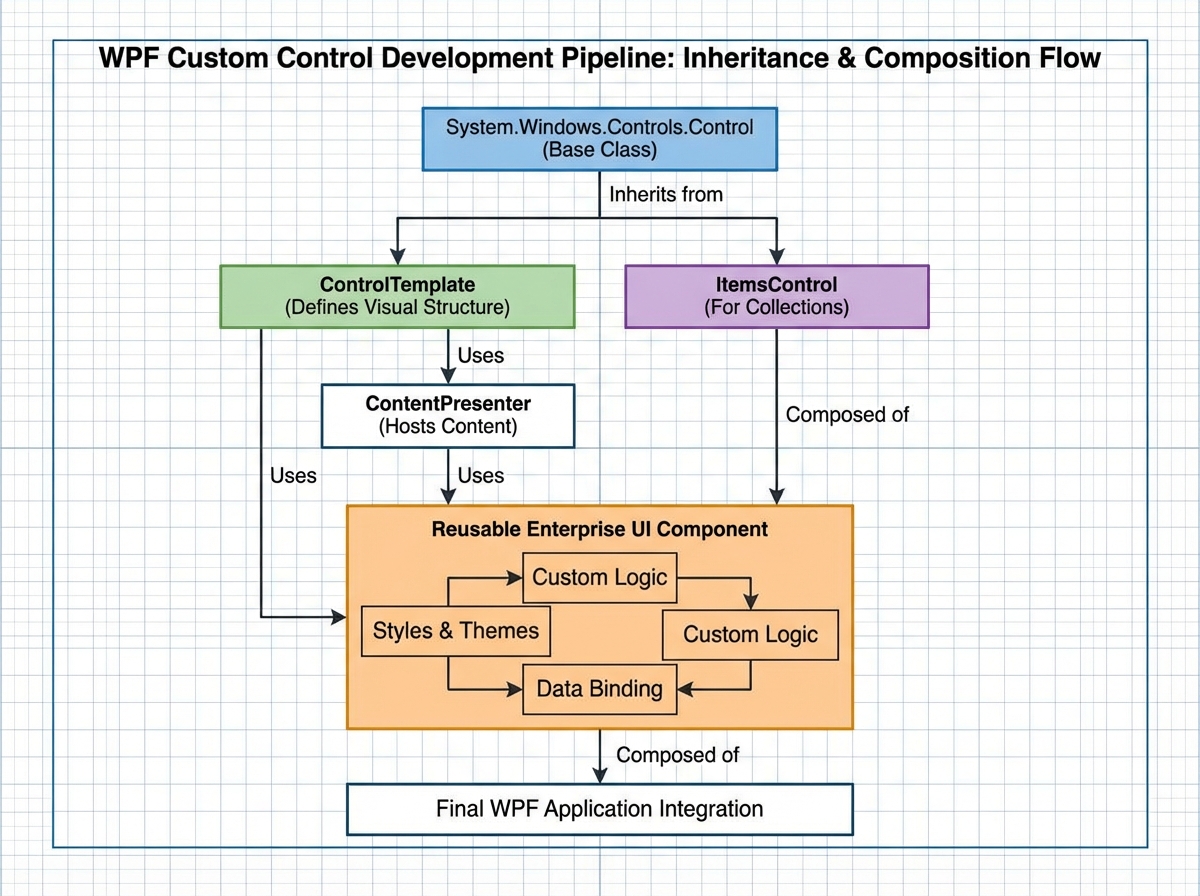
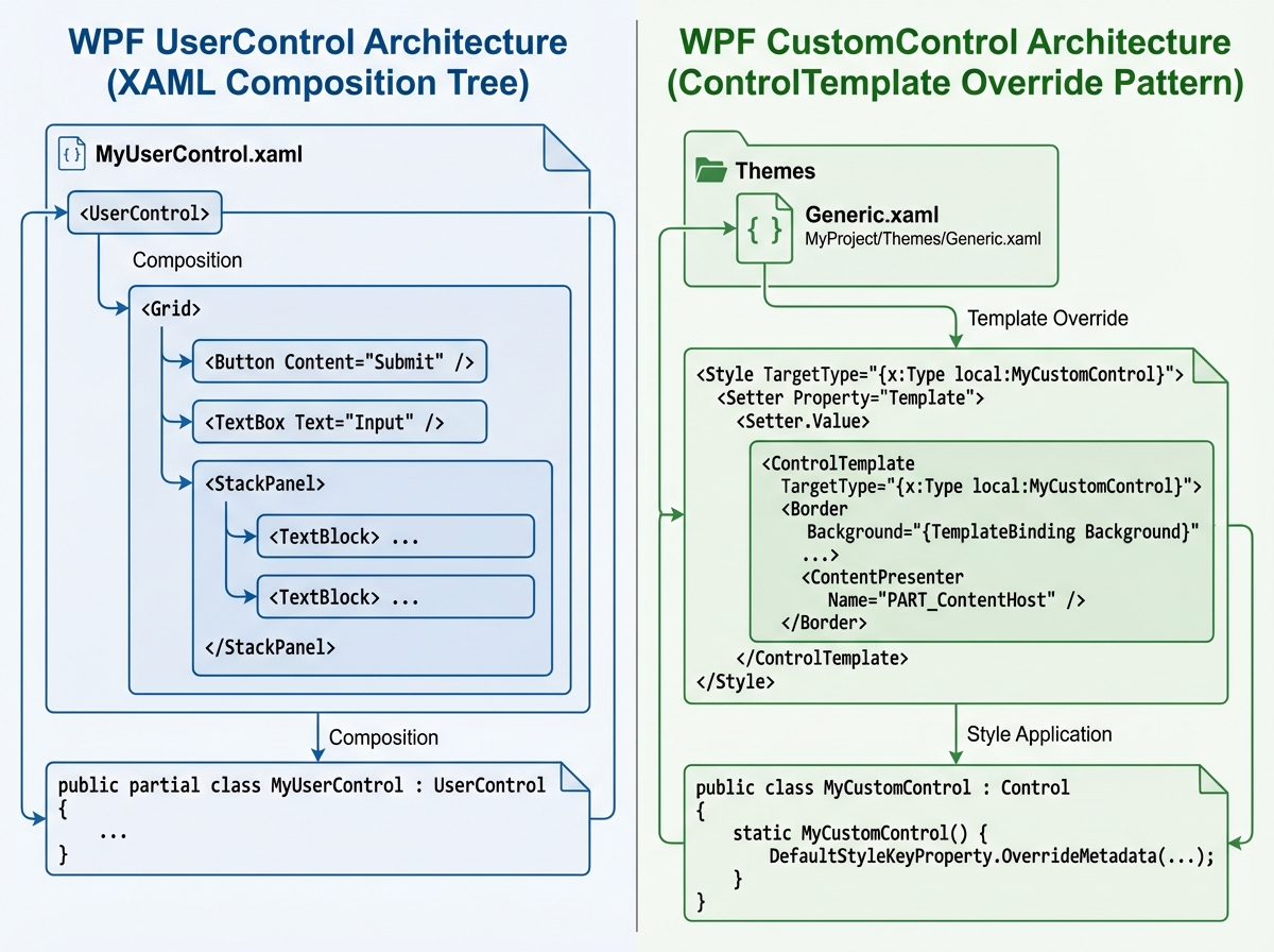
Most developers confuse custom controls with UserControls because the naming is genuinely misleading. A UserControl is a composition — you drop existing controls into a XAML file, wire them up, and ship it. A WPF custom control is something different: a class that defines behavior and dependency properties, paired with a default ControlTemplate in Themes/Generic.xaml that any consumer can completely replace.
The separation is the point. The control doesn’t care what it looks like. It only cares about what it does.
| UserControl | Custom Control | |
|---|---|---|
| XAML file | Yes (embedded) | No (template in Generic.xaml) |
| Styleable/Templateable | Partially | Fully |
| Inheritance | No | Yes |
| Reuse across themes | Limited | Complete |
| Complexity floor | Low | Higher |
The right base class depends on what your control fundamentally represents. If it holds a single piece of content — a header, a card, a toggle — you derive from ContentControl. If it holds a collection of items — a nav bar, a tree node list, a menu — you derive from ItemsControl. Picking the wrong base is the first mistake most people make, and it compounds everything downstream.
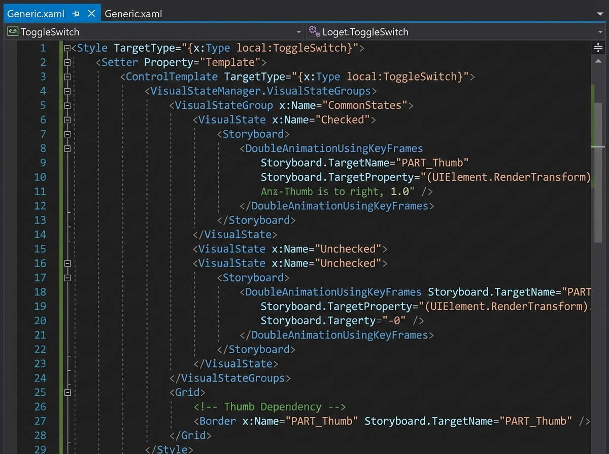
The Toggle Switch That Teaches You Everything
Building a day/night toggle switch sounds trivial. It’s not. It’s the first time most WPF developers are forced to confront what VisualStateManager actually does, why OnApplyTemplate exists, and what it means to expose state through dependency properties instead of code-behind flags.
The biggest mistake people make when starting WPF custom control development is trying to control the animation from C#. You reach for a DispatcherTimer, you manipulate properties directly, and the moment someone applies a custom template, everything breaks because your code assumes a specific visual structure that may not exist. The control’s behavior becomes inseparable from its appearance — which is exactly what you were trying to avoid.
The realization comes when you move the animation into the ControlTemplate using VisualStateManager.GoToState(). The C# code becomes a single method call. The template handles everything visual. Suddenly the control works regardless of who styled it or how. That’s the mental model that unlocks the rest of WPF custom control work.
After this, dependency properties stop feeling like ceremony. They’re not just bindable properties — they’re the formal API surface of your control. Everything the template or the consumer needs to respond to has to be declared there.
Building Game-Level Controls with ContentControl
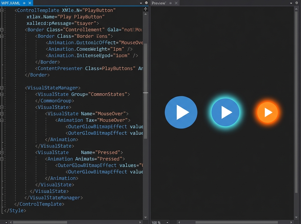
The League of Legends play button and the RiotSlider exercises are deliberately provocative choices for teaching material. The goal isn’t to ship game UI — it’s to force you to study a control whose visual design has zero tolerance for compromise and reverse-engineer how to build it purely through ControlTemplate composition.
A ContentControl becomes interesting when you use it to build controls that wrap a single interactive element with rich chrome — a glowing border, a state-reactive background, an animated inner layer. The ContentPresenter is where the consumer’s content lands. Everything else is yours to design. You can stack transforms, use clip geometry, trigger animations on IsPressed or IsMouseOver, and none of it touches the content.
The RiotSlider dissection is where PART_ naming conventions stop being documentation trivia and start mattering. The standard WPF Slider has named template parts — PART_Track, PART_SelectionRange — that the control’s C# code looks up by name inside OnApplyTemplate. If you rename them in your template, the control silently breaks. Understanding this pattern means you can consume the original Slider’s behavior while completely replacing its visual structure. That’s Python OOP-level thinking applied to UI: behavior and structure are genuinely separated, connected only by contract.
When ItemsControl Becomes Your Best Friend
The ListBox navigation bar exercise is where most developers feel genuinely lost the first time. You’re not just styling list items — you’re building a smooth animated navigation system where the selected indicator moves between items independently, like a sliding underline.
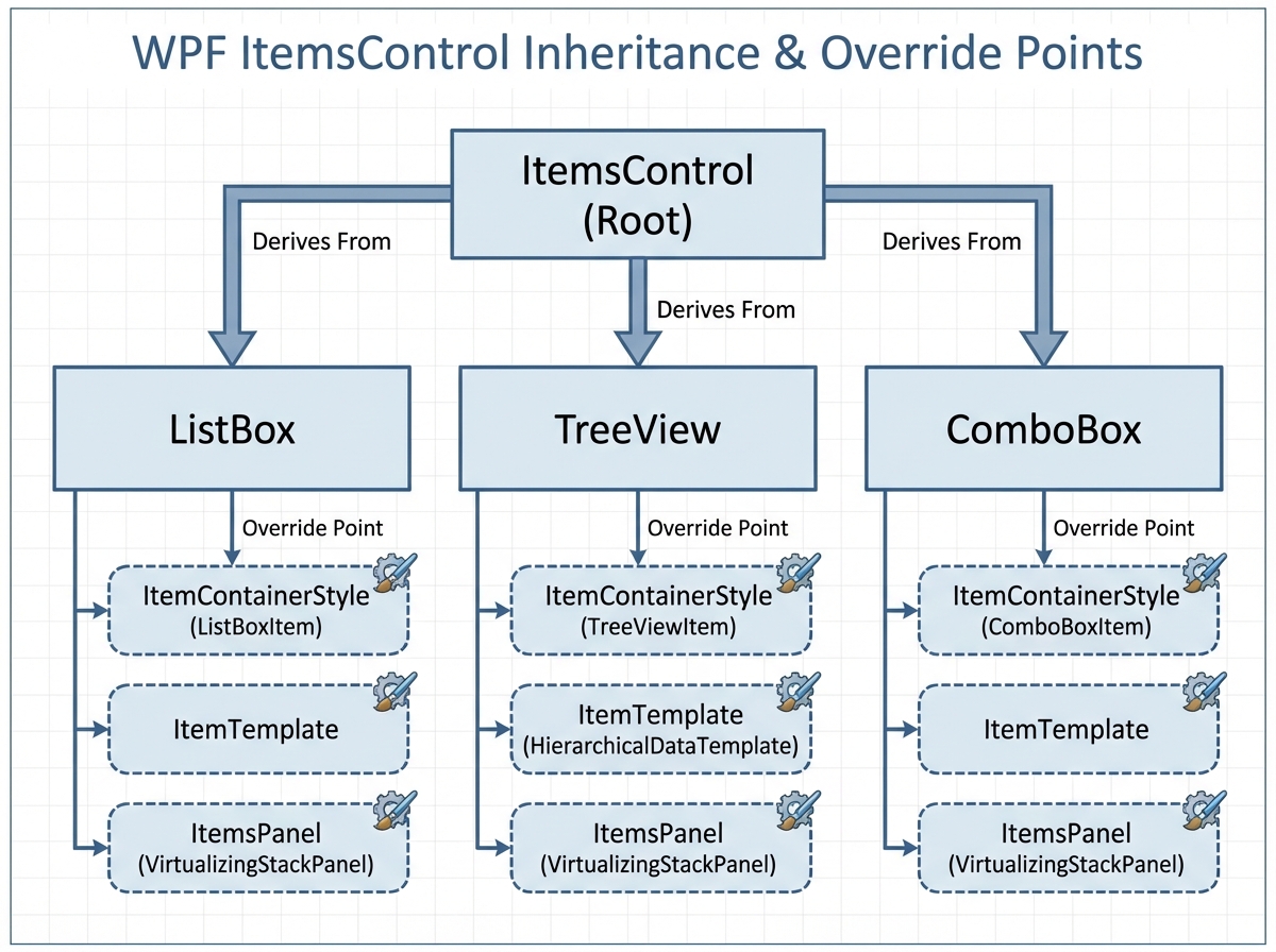
ItemsControl is the underlying machinery for every collection-based control in WPF: ListBox, ListView, TreeView, ComboBox — all of them. When you learn to build directly from ItemsControl, you understand why those controls behave the way they do, and more importantly, you know exactly which part to override when they don’t behave the way you need.
The animated navigation bar specifically teaches you how to drive visual transitions from a property change at the data level — not from mouse events wired in code. When the selected item changes, a transform animates. That animation lives entirely in XAML. The C# model only knows about which item is selected. This is the point where the MVVM pattern and custom controls start making each other stronger instead of fighting for control.
The TreeView Problem Nobody Warns You About
Recursive ItemsControl with Cupertino-style tree nodes is where the WPF custom control development path gets genuinely hard. Not algorithmically hard — conceptually hard in a way that exposes gaps in your mental model.
A tree structure in WPF isn’t a custom control that calls itself. It’s a HierarchicalDataTemplate binding to a recursive data structure, with an ItemsControl that generates its own child ItemsControls dynamically. The visual recursion is driven by the data, not by code. If you try to build the recursion in C# by nesting controls manually, you’ll hit performance walls immediately and the result won’t support virtualization.
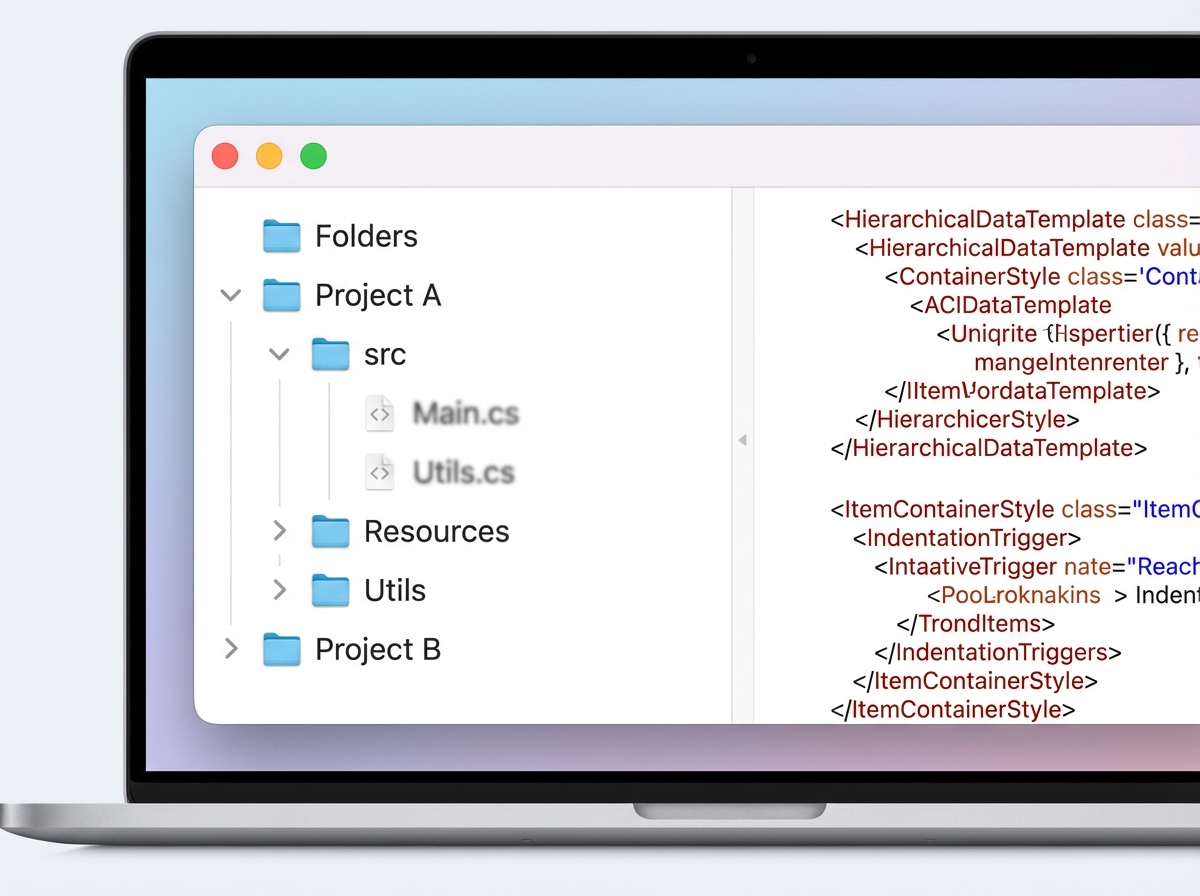
The Cupertino styling constraint makes this harder and more instructive. You’re forced to control indentation, expand/collapse animations, connector lines, and selection state entirely through ControlTemplate and style triggers — with no code-behind shortcuts. By the end, you understand why TreeViewItem derives from HeaderedItemsControl and why WPF’s stock TreeView is designed the way it is. The framework decisions stop looking arbitrary.
Theme Architecture That Doesn’t Fall Apart
The ResourceDictionary-based dynamic theme framework is where individual control work becomes system-level thinking. Building a single good custom control is hard enough. Building an architecture where ten controls all switch between light and dark themes at runtime, consistently, without a single hardcoded color anywhere — that’s a different skill.
The most common failure at this stage is treating ResourceDictionary like a config file. You define colors, you reference them in templates, you swap the dictionary at runtime and half the controls update while the other half don’t. The root cause is almost always that some bindings reference static resources instead of dynamic resources, or that merged dictionary order breaks the lookup chain in ways that only surface at runtime.
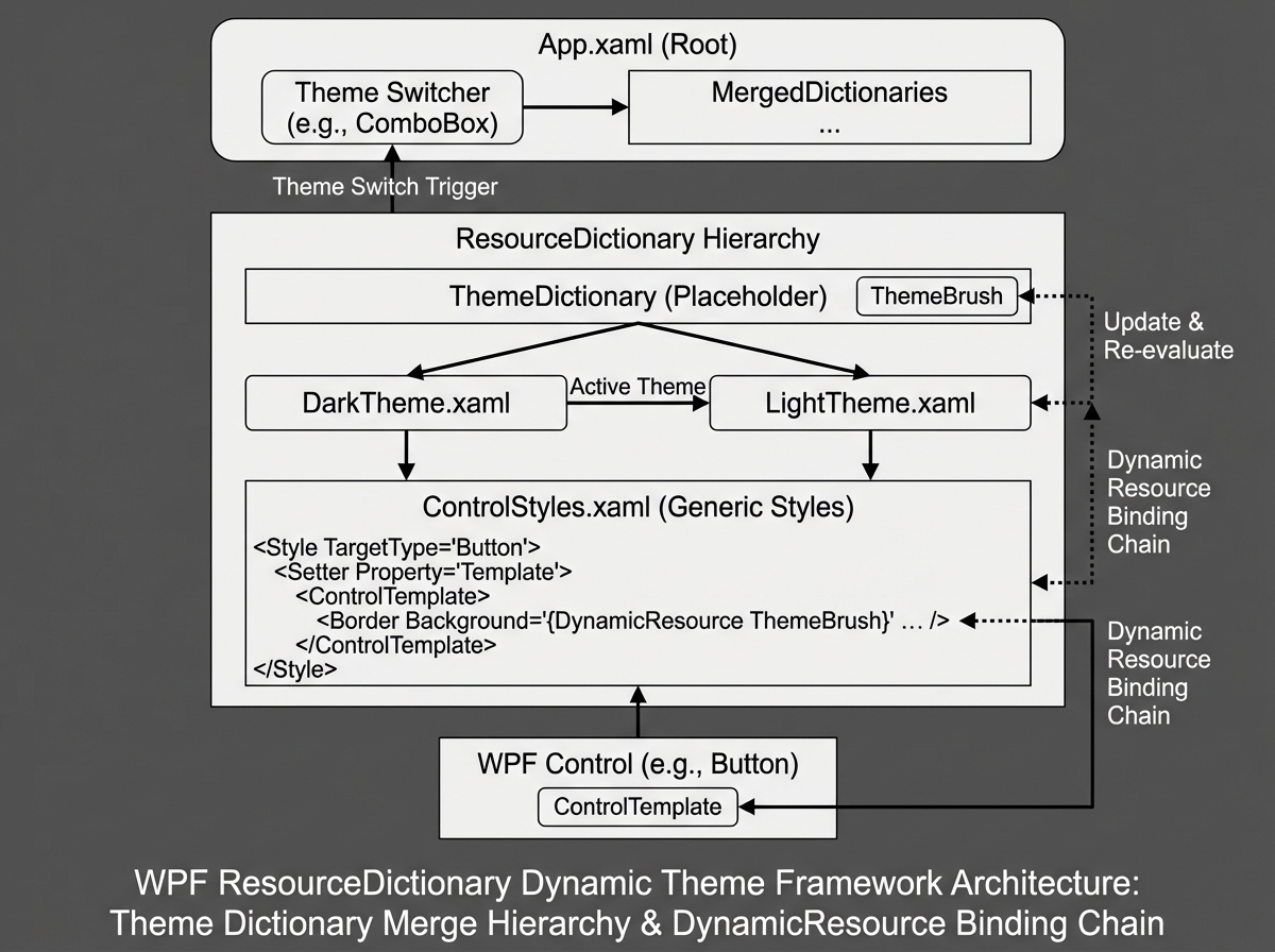
When the architecture works, it works cleanly. Every control has exactly one ControlTemplate per theme namespace. The application-level dictionary swap triggers a cascading visual update across the entire window in a single frame. At this point you realize the entire WPF styling system was designed for exactly this — you were just using it wrong for years.
From WPF to OpenSilver: Shared Architecture That Scales
The Ollama Manager project — a local LLM client built for both WPF and OpenSilver with a shared architecture — is where everything converges into the question every .NET developer eventually faces: how much of this code can run somewhere else?
OpenSilver is a WebAssembly-based reimplementation of Silverlight that speaks WPF’s XAML dialect. Sharing architecture between a WPF desktop app and an OpenSilver web app forces you to draw a hard line between UI layer and everything beneath it. The custom controls, the ViewModels, the service interfaces — all of it has to be structured so that the platform-specific rendering layer is the only thing that changes.
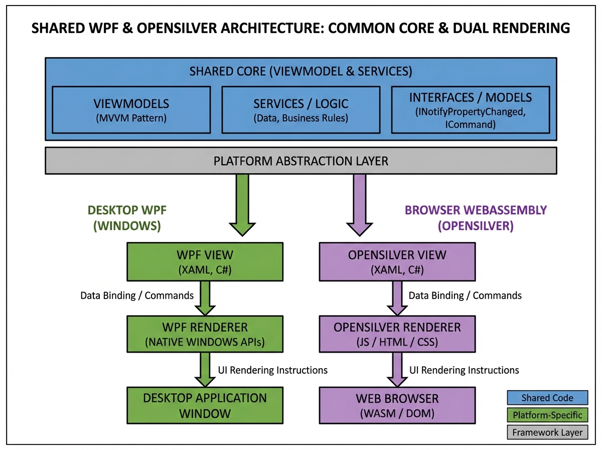
This is the enterprise architecture payoff. The modular design principles, the clean dependency property contracts, the ResourceDictionary-based theming — all of it was quietly building toward portability. When you share a DatePicker custom control between WPF and OpenSilver and it renders correctly on both platforms without modification, the abstraction investment pays off in a way that’s hard to explain until you’ve felt it.
What to Actually Do With All of This
Looking back, the journey from “I can style a button” to “I can design a WPF control framework” isn’t about learning more syntax. It’s about building a mental model of how visual contracts, behavioral logic, and data flow are meant to stay separate — and then trusting that separation even when it feels slower upfront.
Here’s what actually moves the needle when learning advanced WPF custom control development:
- Build a ToggleSwitch before anything else. It forces you to confront VisualStateManager, dependency properties, and OnApplyTemplate in one small, testable unit — every concept you’ll use in every control after it.
- Derive from ContentControl or ItemsControl first, not Control. Starting from the right base class tells WPF what your control fundamentally is, which means less boilerplate and fewer structural mistakes that compound later.
- Put every color and brush through a DynamicResource, from day one. Hardcoded values in ControlTemplates make theme switching impossible to retrofit — the architectural decision has to be made before you have ten controls to fix.
- Study PART_ naming in the WPF source code before building sliders or tracks. The named template part contract is what makes behavioral reuse and visual replacement work simultaneously — you can’t guess your way through it.
- Write your HierarchicalDataTemplate before your TreeViewItem style. The data structure drives the recursive visual structure in WPF, not the other way around — starting with the template saves hours of confused debugging.
- Test every custom control with a completely blank ControlTemplate. If it crashes or silently stops working, your behavior has assumptions about the visual tree that will break in production when someone re-templates it.
- Isolate your ViewModels and services into a shared project from the start. Even if you never target OpenSilver, the discipline of keeping UI contracts clean pays off when you refactor, test, or add a second application surface later.
- Read the WPF open-source code for the control you’re reimplementing. The original Slider, ListBox, and TreeView source code on GitHub shows you exactly which PART_ elements are required and what invariants the C# code assumes — it’s the documentation that actually matters.
Leave a Reply