The first time you stare at a price chart, it looks like noise. Lines going everywhere, candles stacking up and falling apart, and absolutely no obvious signal telling you what to do next. That feeling doesn’t mean you’re bad at this — it means you haven’t learned to read what the chart is actually saying yet.
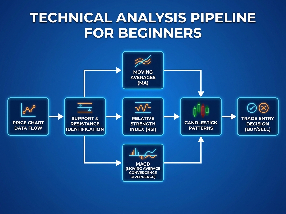
If you’re looking to learn technical analysis for the stock market, the honest answer is that it’s a learnable skill — but not in the way most beginners expect. It isn’t about memorizing every indicator. It’s about building a reading system: start with price structure, layer in context tools like moving averages and Fibonacci, then use momentum indicators like RSI and MACD to confirm what you’re already seeing. That sequence matters more than any single tool.
- Technical analysis works only when you combine structure (support/resistance) with confirmation (RSI, MACD) — using indicators alone is where most beginners lose money
- Candlestick patterns mean almost nothing without understanding the trend they appear in — context is everything
- Risk management and trading psychology determine your long-term results more than your ability to read any indicator
What Technical Analysis Actually Is
Technical analysis is the practice of reading price charts to identify patterns, momentum, and probable future movement — without needing to know a company’s financials. It works on the assumption that all available information is already baked into price, and that human behavior creates repeatable patterns.
| Approach | What It Uses | Best For |
|---|---|---|
| Price Action | Candlesticks, support/resistance | Entry and exit precision |
| Trend Tools | Moving averages, Dow Theory | Direction confirmation |
| Momentum Indicators | RSI, MACD, Bollinger Bands | Timing and divergence |
| Pattern Recognition | Chart patterns, Fibonacci | High-probability setups |
For a complete beginner, the biggest trap is jumping straight to indicators before understanding price structure. Every indicator is derived from price — so if you can’t read price directly, the indicator is just noise with extra steps.
Three things that separate working traders from losing ones:
- They read the trend before reading any indicator
- They size positions based on where their stop loss sits, not on gut feeling
- They treat losing trades as information, not failure
How Long It Takes to Actually Get This
| Stage | Content | Time |
|---|---|---|
| Foundation | Trading psychology, TA principles, support/resistance | 1–2 weeks |
| Trend Tools | Moving averages, Fibonacci retracement, Dow Theory | 1–2 weeks |
| Indicators | RSI, MACD, Bollinger Bands, Mean Reversion | 2–3 weeks |
| Pattern Literacy | Candlestick types, chart patterns, multi-timeframe setups | 2–3 weeks |
| Live Application | Paper trading setups, risk management practice | Ongoing |
| Total | Full beginner-to-confident timeline | 6–10 weeks |
The order matters more than the speed — someone who spends three weeks on price structure before touching RSI will outperform someone who rushes through everything in two weeks. If you’re taking longer than the estimate, it almost always means you’re going deeper on the parts that matter most, which is exactly right.
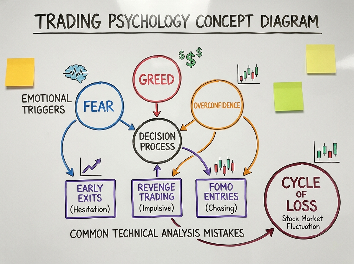
The Mindset Problem Nobody Warns You About
Most beginners spend their first weeks obsessing over which indicator is the best. RSI versus MACD. Simple moving average versus exponential. They treat technical analysis like a tool selection problem — as if finding the right combination unlocks consistent profits.
The real issue is almost always psychological. Fear of missing a move pushes you into entries with no structure behind them. The discomfort of a losing trade makes you close winners too early and hold losers too long. These aren’t personality flaws — they’re hardwired responses to uncertainty that every trader has to consciously override.
Trading psychology comes first in the learning sequence for exactly this reason. Until you understand how greed and fear physically affect your decision-making in real time, every technical skill you build sits on an unstable foundation. The traders who survive long enough to get good are the ones who addressed this before they were forced to.
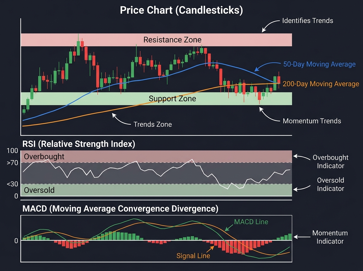
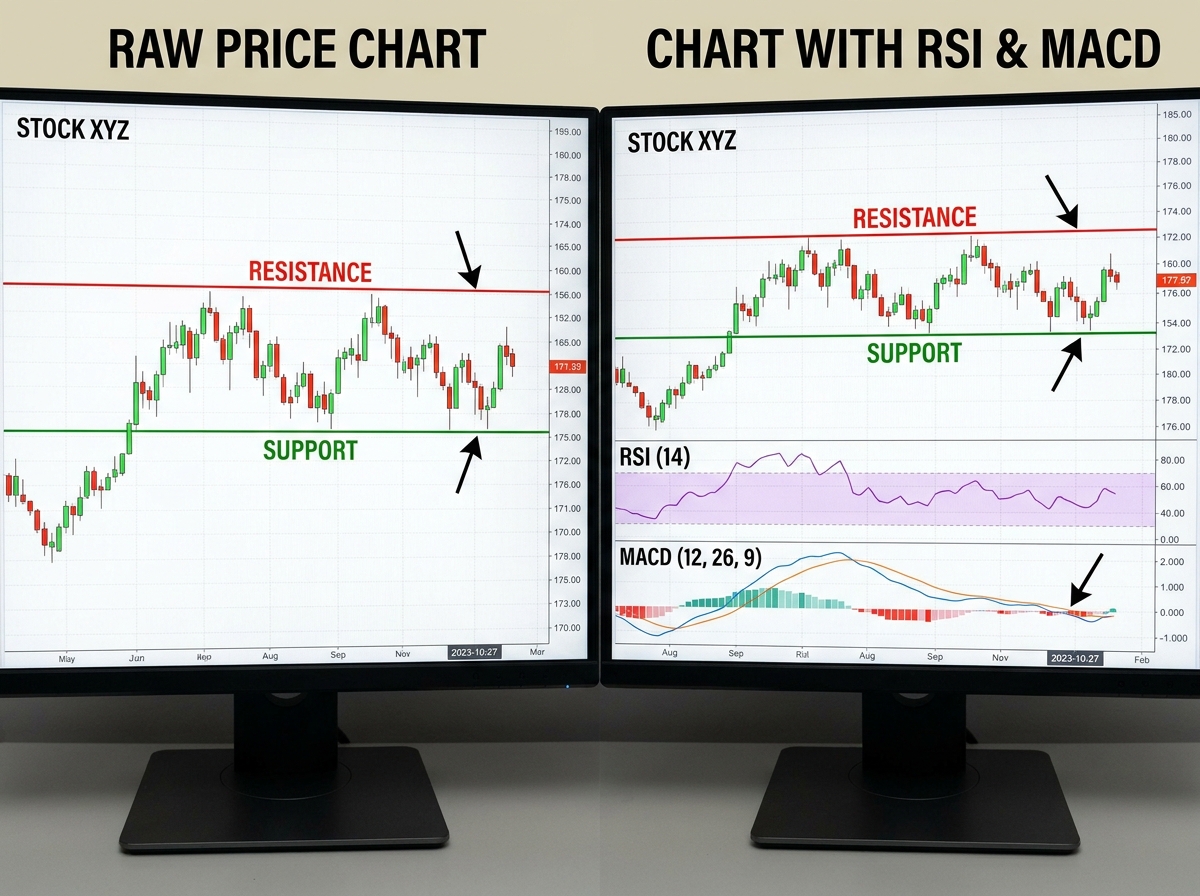
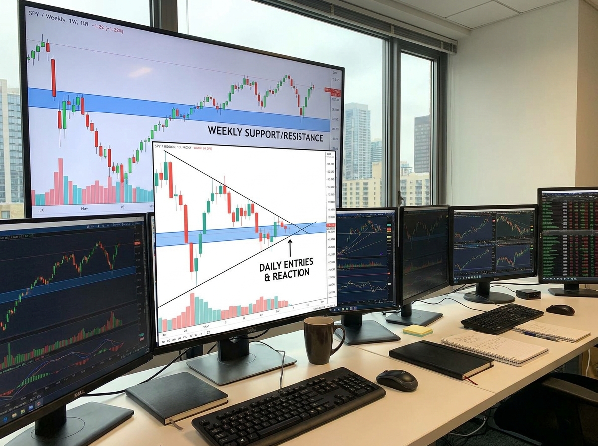
Support, Resistance, and Why Most Beginners Draw Them Wrong
Support and resistance are the skeleton of any chart. They’re the price levels where buyers and sellers have repeatedly collided, creating zones that price tends to react to again. Getting this right changes everything — getting it wrong means every indicator you layer on top gives you false signals.
The biggest mistake people make when learning technical analysis for beginners is treating support and resistance like exact lines. They’re zones, not surgical cuts. A level that held four times at 1,420 might break at 1,415 on the fifth test — and that’s not the level failing, that’s the level working exactly as it should. When you start thinking in zones instead of lines, you stop getting shaken out of good trades by tiny wicks.
Multi-timeframe analysis is the part that makes support and resistance genuinely powerful. A level that appears on the weekly chart carries far more weight than one that only shows up on the 15-minute chart. Learning to zoom out before zooming in — confirming your levels on higher timeframes before executing on lower ones — is the shift that takes support/resistance from a drawing exercise to an actual edge.
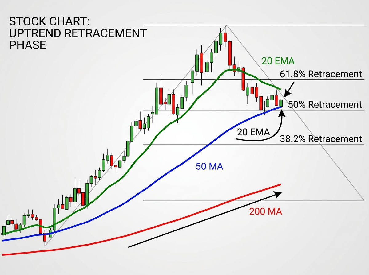
Moving Averages, Fibonacci, and Reading Market Context
Once you can read price structure, moving averages become genuinely useful. Before that, they’re just a lagging line you’re chasing. The 20 EMA tells you where short-term momentum lives. The 50 MA tells you whether the medium-term trend is with you or against you. The 200 MA tells you which side of the market you should be on for swing trades. Used together, they create a layered picture of market context that no single indicator gives you.
Fibonacci retracement was the concept that confused me the longest. It sounds mystical — drawing lines based on mathematical ratios to predict where price will bounce. But the reason it works has nothing to do with numerology. It works because enough traders watch the same levels that they become self-fulfilling reference points. The 61.8% retracement level is watched by professionals globally. When price pulls back to it in a strong uptrend and stalls, that’s not coincidence — that’s where institutional buyers have their orders sitting.
Dow Theory ties everything together. It’s the oldest framework in technical analysis, and it’s still relevant because it describes something true about how markets move: trends develop in phases, primary trends have secondary corrections, and volume confirms price moves. Understanding these principles prevents you from calling tops and bottoms too early, which is the single most expensive mistake trend-following traders make.
For those already comfortable with coding and data, backtesting quantitative trading strategies in Python is a natural next step once you’ve built your manual reading skills — it lets you validate whether the patterns you’re seeing actually have statistical edge.
RSI, MACD, and the Indicators That Actually Tell You Something
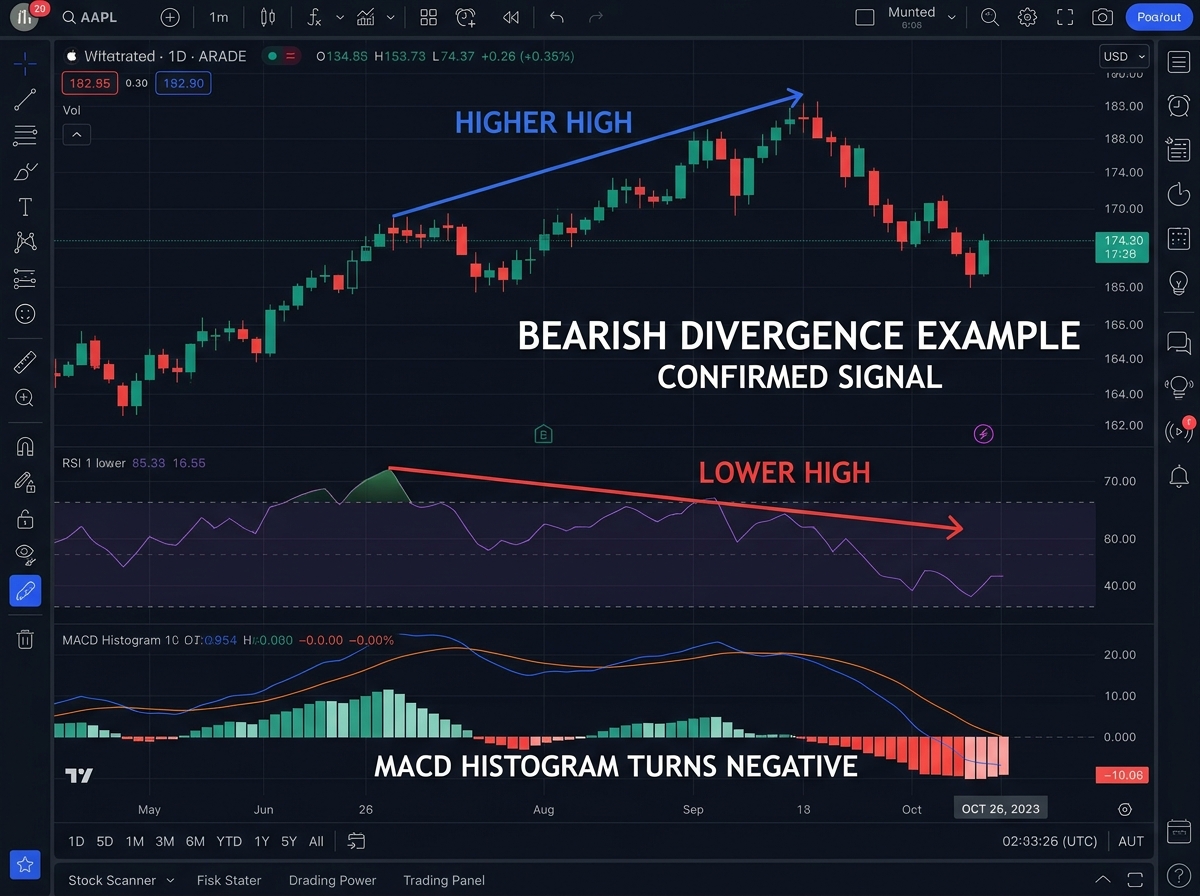
RSI — the Relative Strength Index — measures the speed and magnitude of price changes on a scale from 0 to 100. The standard reading is that above 70 means overbought and below 30 means oversold. Most beginners take that literally and start fading every high RSI reading. That’s not how it works in practice.
The concept that actually produces results is RSI divergence. When price makes a new high but RSI makes a lower high, momentum is weakening before price shows it. That divergence is an early warning. Hidden divergence — where price makes a higher low in an uptrend but RSI makes a lower low — signals trend continuation. These two readings alone give you more actionable information than overbought/oversold thresholds ever will.
MACD and Bollinger Bands serve different purposes. MACD is a momentum and trend-change tool — the signal line crossover and histogram reversals tell you when momentum is shifting. Bollinger Bands are a volatility and mean reversion tool — when price stretches to the outer band and then reverses, mean reversion back toward the 20-period middle band is the expected move. Using them together, without overlapping their signals, gives you a more complete picture of what the market is doing right now versus where it came from.
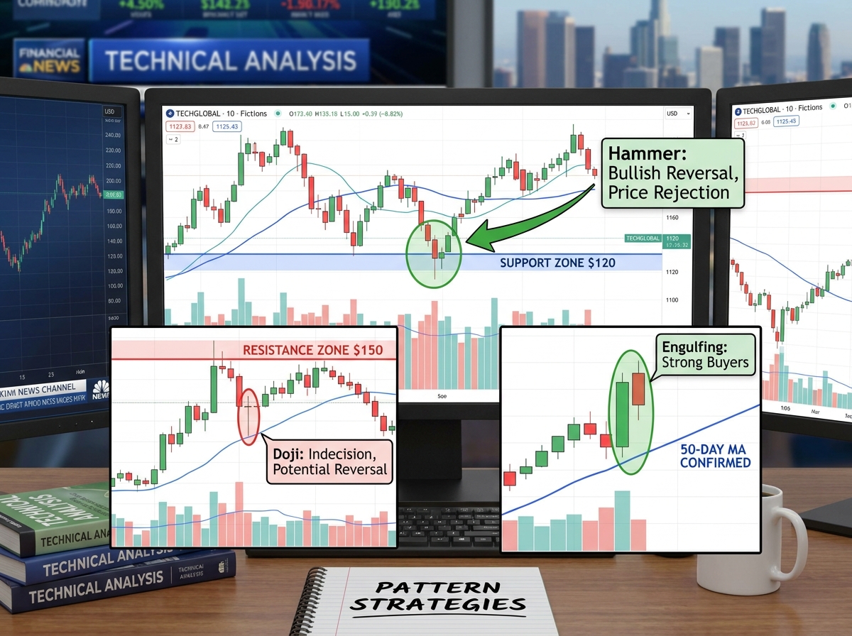
Candlestick Patterns and What They’re Really Telling You
Candlesticks are the language of price action. Each candle tells a complete story about the battle between buyers and sellers during that specific period — who was in control, who lost control, and whether conviction was strong or weak.
A doji candle doesn’t mean “reversal incoming.” It means indecision. A hammer at a major support level after a sustained downtrend means something very different from a hammer in the middle of a consolidation range. This is where relative analysis of candlesticks becomes the skill — not memorizing what each pattern looks like in isolation, but reading what it means given where price has been and where the key levels are.
Chart patterns like head and shoulders, double tops, flags, and triangles are just collections of candlestick behavior that repeat because trader psychology is consistent. The breakout from a bull flag means something specific: consolidation after a strong move, sellers exhausting themselves, buyers stepping back in with conviction. When you layer Fibonacci levels onto these patterns — measuring the flagpole to project the target — you stop guessing where price might go and start trading with a defined expectation.
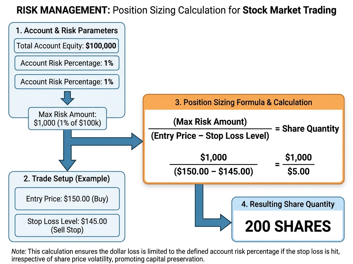
Risk Management Is Where the Money Actually Lives
Everything up to this point is pattern recognition. Risk management is what determines whether your pattern recognition translates into a growing account or a series of losses that wipes out your gains.
Position sizing is the mechanism most beginners completely ignore. The instinct is to bet more when you’re confident and less when you’re unsure. The correct approach is to bet based on where your stop loss sits relative to your entry — not on how confident you feel. If your stop is tight (low risk per share), you can take a larger position. If your stop is wide, you take a smaller position. Consistent risk per trade, regardless of conviction, is what keeps a bad week from becoming a catastrophic one.
Sector rotation and ratio analysis add a layer that most retail traders never reach. Understanding which sectors are leading the market — where institutional money is flowing — lets you bias your setups toward stocks with the wind at their back. A strong technical setup in a weak sector is a lower-probability trade than the same setup in the leading sector. The chart is local; sector context is the weather system surrounding it.
If you’re also exploring broader market instruments, understanding tools like forex pattern trading applies many of the same technical analysis principles — support/resistance, Fibonacci, and momentum indicators work across asset classes.
Looking back, the learners who get good at this quickly aren’t the ones who learn the most indicators — they’re the ones who build depth in price structure first and add tools only when they understand what each one is actually measuring. Here’s what to apply right now:
- Draw support and resistance as zones, not lines — mark the cluster of candle bodies and wicks around a level, not a single price point, and you’ll stop getting faked out by tiny breaks
- Learn RSI divergence before you learn overbought/oversold — divergence between price and RSI is an actual signal; threshold crossings in a trending market are noise
- Use multi-timeframe analysis on every setup — confirm your entry-level structure on the timeframe one step higher before executing; a five-minute setup inside a weekly resistance zone is a completely different trade than the same setup in open air
- Define your stop loss before your entry — the stop determines your position size; never size a trade without knowing exactly where you’re wrong
- Paper trade Fibonacci retracements in a trending stock — watch how price reacts at the 38.2%, 50%, and 61.8% levels for two weeks before trading them with real money; the pattern will become obvious
- Track your losing trades separately from your winners — note whether the loss came from a bad setup, correct setup bad timing, or correct setup with bad execution; they require entirely different fixes
- Apply Bollinger Band mean reversion only in ranging conditions — the same band touch in a trending market is a continuation signal, not a reversal; context changes the meaning completely
- Start sector analysis with a ratio chart — divide the sector ETF by the broad market index; if the ratio is rising, the sector is leading; trade setups in leading sectors until the ratio turns
Leave a Reply